
Through these years I’ve learnt that UI design is one of the hardest, widest and, maybe for begginners, more underestimated tasks in a game. Why? UI shows information about things that player should or might want to know, but are difficult to express in terms of the gameplay or in the world itself. Even in real life those may be incredibly difficult or impossible to tell exactly: “value your health status”, “How much money do you have in your pocket?”… imprecise, or not an immediate answer for these, but sometimes games and players demand it. And the problems arise when you need to decide what “sometimes” means regarding our game.
There have been tons of examples about good and bad UIs, and I always like pointing out Donkey Kong Country’s in-game UI as an example of really good UI: “no” UI at all. DKC goes exactly to the point at the “sometimes” word: when something happens, the UI shows and reflects the change and hides after few seconds. Did you pick a bunch of bananas or an extra life? See now how many do you have, and then have the whole screen for you again. This case is simpler than many other games, but I find it great because it provides players the information they might need when it makes sense in the current context. Most of the time players don’t care about that count, they are focused on the current challenge instead. Absolutely unintrusive.
What would be “realistic” -and absolutely inappropriate- would be placing a whole bunch of bananas in a backpack, so you really “see” how many Donkey is carrying. It would remove the need for that UI, sure, but does not fit here and wouldn’t be useful. This is what developers did with health in Resident Evil or Dead Space series: remove that information from UI and put it in the world, in the character itself. Others have made really good analysis before in Gamasutra here (“What players want”) and here (“User interface design in video games”), so go check those links for further, more detailed, info.
The first link got it nailed in the name: “what players want” -and even what they don’t know they want. The UI must serve them, be useful for them.
Some guidelines
MustShould provide useful information when neededMustShould not get players out of contextMustShould be alive
Sometimes the “Must” is not so apparent, so the “Should” comes instead, but the idea remains the same. Back to the DKC example, if you play the game you will easily notice that those guidelines are there. They are concise, simple to understand, but open enough for you, as a designer, to adapt them to your game. And that is lot of work, iterating the design.
Extended explanation about point 1: essential only, just when needed
Information that is not useful, related to the pace of the game, is not information for in-game UI, so should be discarded or it may add “noise”. Sometimes it may be hard to tell if the information fits or not, so in those cases just go without it and test. If players can happily live without that, don’t look back; remove it. There may be, however, circumstances where the element may serve another purpose (setting? mood?), but usually there should be an in-game solution for that.
You can always show the remaining info in a pause screen, for example, but during the game show only when and what players may need to know. A game too fast to pay attention to many things at once? Just put the ammo left and health, and when the player is stopped, safe, show the remaining weapons’ status. This is a hard task, by the way. Even the same info may fit in a game but not other.
Extended explanation about point 2: game context
If there is much discrepancy between the character, game world and the UI, the player might notice and have lesser degree of immersion. A classic UI is not part of the world, it doesn’t belong to it and it is evident and, thus, disruptive. Here everything matters: size, position, color & transparency, animations, setting of the game… UI is integral to the game. You wouldn’t place a sci-fi themed UI in an ancient greek setting, right? A highly detailed high-resolution UI in a pixel-art game aesthetic? Right in the middle on the screen, or in a corner?
Position it far away from the action, and it may be not noticed at all. Too centered, and it may be intrusive. Test and test again. As every game has different needs, there is no one-size-fits-all rule here. Be creative with the solution, iterate.
Extended explanation about point 3: design for updates
The information you will need to show is, with few exceptions, subject to changes during the game. Depending on the game, even really frequent updates: a tachometer in a racing game, the ammo left of the machine gun… Some of these changes may be only a matter of updating a value shown, but the meaning may be slightly different when they are reaching a specific threshold. Or maybe the update itself is really important (level up!). Those updates may have an animation that emphasise what is happening. Design thinking how the UI reacts to those updates not just with a static image.
Example: In game UI in Trespassers
We have iterated quite a lot the in-game UIs, as the gameplay needs changed. Even when the set of needs was fixed, we continued improving the design. We will focus only in the players’ UI. To summarize our needs, in order of importance: characters have health, money, grenades that can be thrown and lost, an optional weapon with finite ammo when the player picks one, the current level and experience remaining for next level. Let’s start with the UI we designed a year ago (aprox.):

And lets focus on the first player part only:
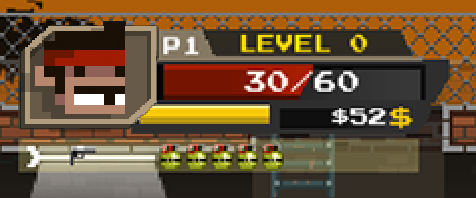
How many problems you can point out? There are a lot of them, but let’s start with 3 of them:

Ok, so there are 3 major flaws right now. We will deal with many others later on.
- Money is more important than what its size and position represents. Is not so big and the white color mixes with the health label (and yeah, ‘$’ is repeated too)
- Level is not so important, yet is clearly visible and taking more space than it needs
- It is hard to tell what this is: a gun, maybe, followed by 5 grenades… definitely, not easy to read as it the icon is too detailed for the size and all gets mixed with the scene
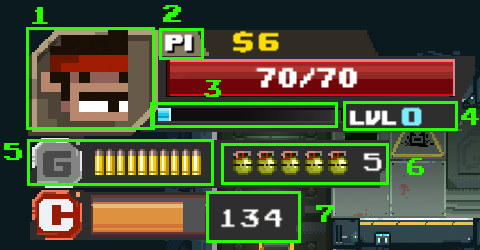
So let’s iterate towards a first solution:

Fixes:
- The money was placed where it is easy to read. It has to do with the yellow bar which represents the “experience”, the progress towards the next level. That’s why we decided to put them together, as they were related. But players didn’t notice, and probably didn’t care. Out!
- Level info was shortened and placed close to the xp bar. Both had its color changed, to separate from money (yellow) and health (white over red background). It is not big as it used to be, as it is not so important.
- We went for an abstraction, inspired by Metal Slug: G for Gun, M for Machine gun… And added a solid, dark background which makes it easier to separate the weapons UI from the scene. The bullets show the remaining shots, but as the gun is never depleted, number is not relevant. We placed the label with ammo for grenades.
As a side note, we tested with different fonts. The one used in the end is bolder, had more impact, we think is easier to read.
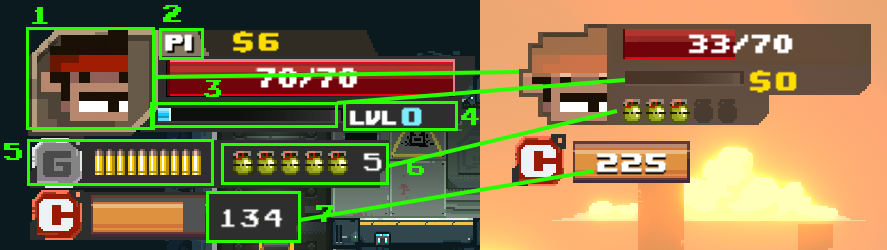
And now we have our “second” iteration (there have been many more). Check that the player picked up a new weapon (‘C’hainsaw), representing its UI below the gun and grenades. A slider shows the fuel remaining. Everything seems readable enough, but… problems! Try to spot them:

Many of them, of course. Let’s check them in order:
- “Big” and “bulky” background for the character, with lines and shadows. As it is an action game, it is important that players can read it fast. These details may distract them.
- “P1”, which stands for “Player 1”. As the avatar in the game relates to the face in the upper left corner, we may not need this info anymore -if it was needed at anytime, but to resemble those 90’s arcades.
- Experience bar. Well, players usually don’t even look at this. It may be important to know how long until the next level is reached but seems a bit big right now.
- Current level: it is not usually needed. This changes slowly compared with the rest of the UI.
- Gun -basic weapon- UI. It is nice, and has nice animations too, but as the gun never depletes, it is taking space without providing useful information.
- Grenade count: as they are few, maybe we can get rid of the number -they are easy to count just by looking at the icons
- Special weapon ammo: this number could be elsewhere instead of taking space here
Let’s go for the last change!
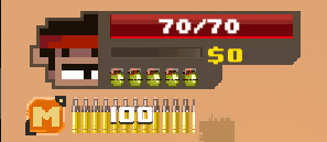
Look at that! What happened? Well… we removed many things
- No more big background for the character: just a small outline. The head needs to be there so players know which information belongs to what character. Furthermore, we could use the image itself as another visual reinforcement to show the health: as the health lowers, the back image (less opaque) is revealed showing a crying character. Think of it as the classic Doom’s head in the UI, which got blood and injures as the player suffered damage
- No more “Player 1” label
- We reduced the size of the slider. As it is blue, it is easily differentiated from the red -health- and yellow -money- labels.
- No more label for the current level. It is not needed in a second-to-second basis as the other info may be. Could be placed over the face of the character, but we couldn’t get it to work in a convincing way.
- No more basic weapon UI. Maybe it is pretty, but does not provide further information. We prefer the space, so removed an element that may confuse in a quick peek.
- With the current design, with semi transparent background, players may rely on the shape and colour to know the amount of greandes remaining. They are few, so the can be checked fast enough.
- The number showing the ammo left could be integrated in the slider itself.
As an extra point, the UI is now smaller without compromising vital information. It helps placing it into the game without distracting or bothering players. And as there are less parameters, it is easier to read. Finally, here is the result in action:
Takeaways / advices
- The contexts, both temporal and gameplay-related, are the guidelines: they tell when and what to show.
- Integrating the UI in the game setting; it could put the player out of the game by being disruptive/intrusive.
- The UI cannot be designed in a fixed frame: it can be alive, may have animations
Probably a good UI will never be praised or even noticed, but a bad one will surely be noticed. I “hate” working on UIs because it takes much time and in the end it doesn’t get appreciated by most players (it was the point, anyway, wasn’t it?), but I love the challenge they pose, and coming up with solutions that improve the design over and over.
Hope you enjoyed the read. Feel free to say how much do you love and hate working with UIs in a comment. Or Twitter. Or mail. Or… See ya!
Leave a Reply