
Icon creation is such an amusing and challenging skill. I can see some similarities to pixel art. It is both an art and a science. It usually benefits from simplification (“less is more” kind of approach), and definitely it has that inherent beauty of controlling the little details. I have recently come across an interesting post about creating icons, with several guidelines, and I couldn’t help but stop at a very specific point.
But first, here is the link to the 7 Principles of Icon Design (opens in new tab), from Helena Zhang. The post is worth a read and will help anyone approaching the topic. It covers several concepts with visual examples to help explain the how’s and why’s. As you read through it, you may stop at the same point as I did: Alignment. Here is an image summarizing one of the problems outlined:
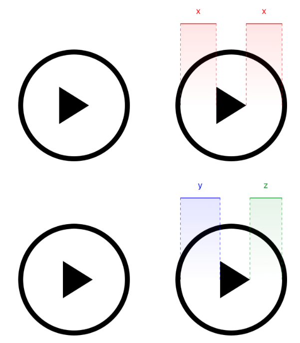
Bottom row: proper alignment with uneven margins
Quoting Helena:
In this play icon, though the triangle is metrically placed in the centre of the circle, our eyes read it as off-kilter. The wider part of the triangle feels ‘heavier’ than the point and is tipping it to the left.
I have to agree with the statement: aligning the centre of the bounding box is not desirable for achieving balance. But if you keep reading, the top highlighted statement reads as follows
The learning is: don’t simply trust the numbers; use your eye to check your work.
To me, that is a misleading statement. Let me refute it.
Trust the (right) numbers
Art and Mathematics have been studied together for centuries. From golden rules to different metrics in music composition, the link has always existed. And I was guessing that there would be a more “technical” approach for aligning those icons if we were to do it ourselves with our untrained eye.
And that’s the key point that leads me to writing this post: how would we train others? Internet is the source of knowledge, probably an incomplete one in some ways. We can expect many self-taught designers learning everywhere, but how would someone trying to learn know if the balance is right or wrong if they don’t have the skill yet and no one to ask? So I decided to do a quick experiment.
Do you remember when you were studying trigonometry? A basic understanding will surely help here, although I won’t be diving much more in all the concepts. You may remember learning about different aspects of triangles (let’s stick to triangles, as they are the easiest polygons with an area). One of those topics was the “centre” of the triangle. Why quotation marks? Because there are many types of centres.
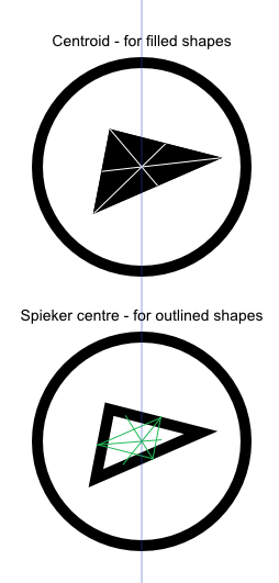
I was considering that, if the problem is aligning visual weights and not areas (and that’s a nice distinction, let’s come back to it later), we could calculate the centre of mass of the object, and use it knowing that it would better align the element. At first, I calculated a point that would split the triangle in two sides of equal area, using a formula for the area of a triangle. But there is an easier way to find that point, the centre of mass; it is referred to as centroid.
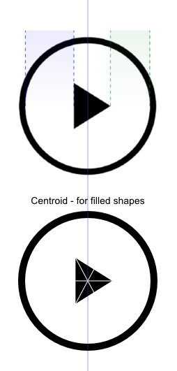
The centroid is found by drawing straight lines from each vertex to the middle of the opposing side. The intersection of these lines is the point we are looking for. Finding the centroid with this process is something that can be easily done in Illustrator, or my tool of choice at the moment, Affinity Designer. Remember that this is just one way of calculating it. In the link above you will find many more ways.
Another “centre” of the triangle
Remember that there was a distinction between visual weight and area. What if the area stays the same but not the visual weight?
According to the description of the Spieker centre, that is “the center of mass of the perimeter of the triangle”. And that sounds like a good choice for outlined icons with preferably thin outlines. It is a widely used style choice, so let’s see how the centroid and this new type of centre are different in a scalene triangle.
This triangle is not meant to be an icon, just a deformation of the previous. I wanted a less harmonic figure, as I could expect differences when comparing different types of centres. It is hard to notice which one is better, but we can still see if there is any difference by overlaying both:
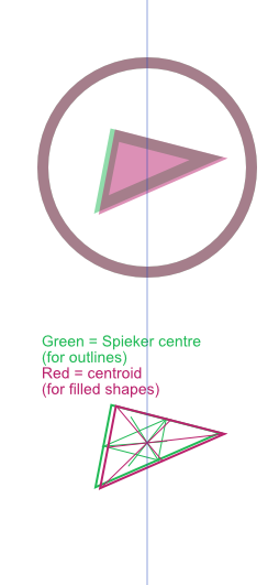
As can be seen, the difference is subtle, but enough to be noticeable when overlaid. My guess would be that, as the outline gets thicker, the optimal alignment point moves towards the centroid. I am sure that there is a way of expanding this information to other differently shaped icons, not just boring triangles, but I haven’t dug that deep yet.
Areas vs visual weight
For completion sake, let´s briefly touch this topic. The area is related to the visual weight, but they are not interchangeable. Compare uniformly filled icons with one gradients: their visual weights are slightly different but their area stands unchanged. The filled ones feel heavier. Below is a quick comparison. Do they still feel as aligned as they did? It is probably harder to tell and, at this point, we may be a bit biased, specially when trying to perceive subtle differences.
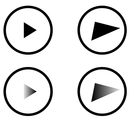
Bottom row: gradient filled from black to 90% white
The differences would increase with other not so uniform patterns, instead of a linear gradient. It feels that the new icons are conveying some sense of motion, as they fade in a direction. The weight moves from left to right (or vice versa)
Closing up
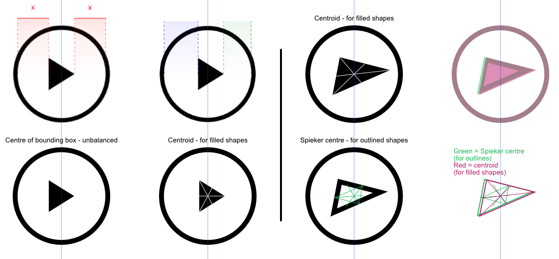
Seems quite obvious that there must be a mathematical approach to finding the best way for aligning elements within other elements, in search for a harmony of some kind. And it is reasonable to expect for designers with years of experience to rely on their trained eyes to perform these tasks. But to whoever may need an alternative route, this may be one. Here is a quick image summarizing everything up to here.
And here are the 4 icons created and used during this brief test.
I hope that this is helpful. But don’t be so meticulous as to spend the whole day perfectly aligning icons that do not work. There is more to icons than mathematical processes for aligning content, and the article from Helena Zhang is a good source of knowledge to start.
One final thought: as one designer I greatly respect once said, “there is no god of interface design watching over us”. We can make choices out of any -apparent- logic that may still work. I don’t think that there is a better way of finishing this slightly technical post than destroying my own points with a sentence like that. 😉
Enjoy it!
References
Original post by Helena Zhang 7 Principles of Icon Design
Wikipedia entry about Triangle center
Wikipedia entry about Centroid
Wikipedia entry about Spieker center
whoiscall
Thanks!